
Our front-end developers at Walk On Digital help build websites your audience can easily interact with. We help optimize the user experience. Our developers help develop and maintain the user interface of websites and apps. When developing websites and mobile apps, we follow SEO best practices to improve performance. In addition, we are responsible for debugging a website and testing its usability.
Our front-end developers use various tools and technologies to build websites and mobile apps for your brand.
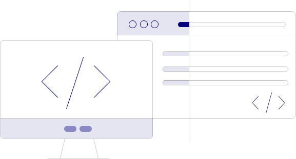
Our developers are proficient in HTML, CSS, and JavaScript. We use HTML to lay your website or app’s structure, CSS for styling, and JavaScript to ensure interactivity.
Our front-end developers may also use other programming languages, such as Python, React.js, Node.js, etc., for developing websites and apps.
Our front-end developers might use different graphic design tools to create a website prototype. It allows them to test the user interface before working on the code.
Our front-end developers use code editing tools to write code for your website. Different code editors serve different purposes. While some are lightweight, others are more featured-rich. Depending on the project requirement, our developers use the appropriate tool to write code.
Our developers use CSS preprocessors to add functionality to CSS coding. It helps your website to be more scalable and improve interactivity. CSS preprocessors transition the code into well-formatted CSS that works across browsers before publishing it on the website.
With the increasing number of mobile users, it is critical to have mobile-friendly websites. Hence, our front-end developers can help create mobile responsive websites for your business. Based on the device and screen size, responsive designs change a website’s layout to fit properly, ensuring mobile users a seamless website experience.
Our front-end developers ensure your website is functional across various browsers. It helps brands not to miss out on potential web users. Browsers are usually consistent; however, their coding interpretation differs. Our front-end developers understand these differences and include them in their code.
Share your project requirements below so we can help you achieve your goals quickly, efficiently, on time and on budget.